

ShortBookandScribes #BlogTour #GuestPost by Paul Tudor Owen, Author of The Weighing of the Heart @PaulTOwen @ObliteratiPress #LoveBooksTours
Welcome to my stop on the blog tour for The Weighing of the Heart by Paul Tudor Owen. I’m delighted to have a guest post by the author about cover design to share with you today. My thanks to Kelly Lacey from Love Books Tours for the place on the tour.
![]()
Following a sudden break-up, Englishman in New York Nick Braeburn takes a room with the elderly Peacock sisters in their lavish Upper East Side apartment, and finds himself increasingly drawn to the priceless piece of Egyptian art on their study wall – and to Lydia, the beautiful Portuguese artist who lives across the roof garden.
But as Nick draws Lydia into a crime he hopes will bring them together, they both begin to unravel, and each find that the other is not quite who they seem.
Paul Tudor Owen’s intriguing debut novel brilliantly evokes the New York of Paul Auster and Joseph O’Neill.
![]()
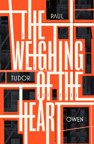
Cover Design by Paul Tudor Owen
If you’re an aspiring author, one of the things you’ve probably thought about in an idle moment – along with your Desert Island Discs and your author photo – is what your book cover might look like when your novel finally becomes a reality.
It was definitely something I gave a lot of thought to in the period after Obliterati Press had agreed to publish my novel The Weighing of the Heart and while we were editing the book.
The Weighing of the Heart is about a young British guy living in New York called Nick Braeburn, who moves in with a couple of rich older ladies as a lodger in their opulent apartment on the Upper East Side. He gets together with their other tenant, Lydia, who lives next door, and the two of them steal a priceless work of art from the study wall.
The work of art that Nick and Lydia take is an Ancient Egyptian scene, and as the stress of the theft starts to work on them, the imagery of Ancient Egypt, the imagery in the painting, starts to come to life around them, and it’s intended to be unclear whether this is something that is really happening or whether it’s all in Nick’s head.
So visually there was plenty to work with there.
I was keen for the cover to reflect the prevailing style of artwork for literary fiction – as a debut novelist, I wanted it to send a signal as quickly as possible to the viewer about what sort of book this was.
But if you had asked me before this process what the cover should look like, I would probably have said it should be based around a compelling photograph of the New York skyline, fire escapes fighting for space with water towers and skyscrapers.
In fact, as I discovered when I went on a reconnaissance mission to the Barnes and Noble bookshop in Manhattan’s Union Square, near where I was living, covers for literary fiction currently looked nothing like this. The style of the moment seemed to be very much influenced by Saul Bass’s 1950s posters for Alfred Hitchcock and others: blocky colours, jagged lines, and not a photograph in sight. Photos might be used on the covers of thrillers, romance novels, or ‘misery memoirs’, it seemed, but not really for literary fiction.
So I took pictures of all the covers I liked and noted down who had designed them, and then contacted the designers and asked if they would be interested in working on The Weighing of the Heart.


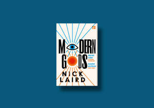
My first choice was Jack Smyth. I had seen his cover for Nick Laird’s Modern Gods and it was just the kind of thing I wanted. He came back quite quickly to say he was interested, and I snapped him up.
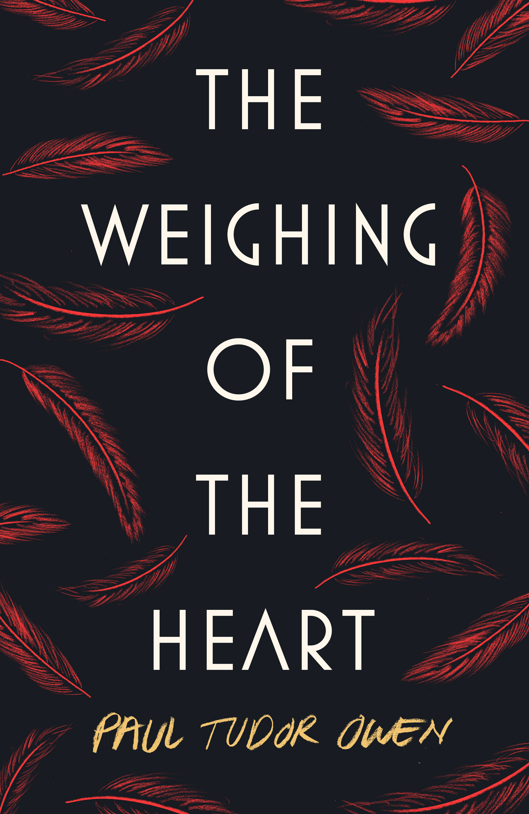
I really enjoyed the process of developing the final design. Jack sent my publishers and me five or six initial designs, each of them quite radically different. One – suggestive of two hanging weights – resembled a stylish 1950s paperback. One – featuring cascading red feathers – looked like the hardback edition of a novel that might win the Booker. Another, which I really loved, was based around the New York street grid.
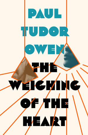
In the end we felt that there were lots of books set in Manhattan that used the iconography of New York on their covers. The Ancient Egyptian theme in The Weighing of the Heart, we concluded, was more unusual and would be more distinctive.
We settled on the basic design of the title projected in a large font and three ancient Egyptian symbols or images placed around it. One thing I was very conscious of was that I wanted the cover to be able to stand out in a bookshop, but also as a much smaller image online – since that is where most people are going to see it nowadays. It had to do both, and this design from Jack definitely did that.
So the final question was which three Ancient Egyptian symbols we would use.
The title of my novel refers to an Ancient Egyptian ceremony depicted in the painting Nick and Lydia steal.
The artwork shows a dead person undergoing a process called ‘the weighing of the heart’, in some ways similar to the Christian idea of St Peter standing at the gates of Heaven, deciding whether or not someone has lived a worthy enough life to come in.
In the Ancient Egyptian version, Anubis, the god of embalming, presides over a set of weighing scales, with the heart of the dead person on one side and a feather on the other.
If the heart is in balance with the feather, you get to go to Heaven, which they called the Field of Reeds.
But if your heart is heavier than the feather, you get eaten by an appalling monster called the Devourer, who has the head of a crocodile, the body of a lion, and the back legs of a hippopotamus.
So there were plenty of images to choose from. I was very keen on a scarab. In Ancient Egyptian mythology, the heart could speak up against you during the ‘weighing of the heart’ ceremony, revealing your worst sins to Anubis at this crucial moment. You could prevent this from happening by keeping hold of a little ‘heart scarab’. But it was just too complex an image and it didn’t really work as part of this cover.
In the end we went with the feather, obviously crucial to the ceremony; the sun, which seemed very striking and conveyed some sense of the heat or the geography of Ancient Egypt; and Anubis’ face, which is instantly recognisable and very distinctive.
The feedback regarding the cover has been really positive. People seem to enjoy posting it on social media, and in bookshops and elsewhere it gets a lot of praise. Musician and poet Jennifer Juan, who interviewed me for her podcast recently, said: “It gives you a slight hint of what the book will contain but not enough to spoil it. It keeps you interested, and I think that is really the mark of a good cover.” All credit goes to Jack Smyth – he did an amazing job.
- Paul Tudor Owen’s debut novel The Weighing of the Heart is published by Obliterati Press and has been nominated for the People’s Book Prize 2019 and the Not the Booker Prize 2019
Thank you, Paul, for such an interesting post. Getting the cover right is so important and the design for your book works so well.
![]()
![]()
 Paul Tudor Owen was born in Manchester in 1978, and was educated at the University of Sheffield, the University of Pittsburgh, and the London School of Economics.
He began his career as a local newspaper reporter in north-west London, and currently works at the Guardian, where he spent three years as deputy head of US news at the paper’s New York office.
Discover more from Short Book and Scribes
Subscribe to get the latest posts sent to your email.